Who decides what counts as AI slop?
TL;DR
- Nobody decides what AI slop is. It’s whatever shows up on too many sites.
- The skills that fight it write new rules, and when everyone runs the same rules, those start repeating too. I found three times it already happened.
- AI is a good website builder but not a good designer. Decide the look yourself, then let it build.
AI is slowly ruining web design, and it’s changing how people see creative work along the way. I started thinking about this after Chris T., a designer on X, posted about it on 21 October. He’d seen people installing a “taste” design skill for Claude, and it worried him. What if these rules become the standard, and AI ends up deciding what designers should do? His example was the eyebrow, the small line of text above a headline. People now call it AI slop, even though newspapers have used it forever and call it a kicker.
So who actually decides what AI slop is? What if a brand really wants a purple gradient as its identity, but can’t use it because people will read it as AI? And what happens when the rules that are supposed to help us avoid slop become the standard for slop themselves? That’s already happening, and you can see it in how the design skills changed over the last year.
How something becomes slop
Slop is mostly about repetition. Without clear direction, AI has to guess what you want, so it reaches for whatever it saw most in training. Take Tailwind UI, a popular kit of website parts that made its buttons indigo in 2020. A huge number of sites were built with it, and the common theory is that the models learned from sites like those, because soon AI-made interfaces leaned hard toward indigo and purple. In August 2025 Tailwind’s creator, Adam Wathan, apologized for it on X, half joking.
Anthropic calls this distributional convergence: left alone, the model picks the most common, safest option. So you get Inter, a purple gradient, a grid of rounded cards and a big headline with a little label above it. None of these are bad on their own. People just saw them on so many sites that they learned to read them as “nobody chose this,” and started valuing human design and human work more again.
Then just add a rule, right?
The obvious fix is a rule that says don’t use indigo, and that’s what design skills are: text files with rules Claude follows. I wrote a whole post on skills if you’re new to them. Anthropic’s own design skill, frontend-design, shows about a million installs as of October. The big community ones are Impeccable and Taste Skill, which has over 100,000 stars on GitHub.
Across their versions they ban much the same things: Inter, purple, gradients, card grids, em dashes. They don’t stay put, though. Taste Skill used to allow one eyebrow every three sections and now bans them completely, and Impeccable bans them too, while its public checker only says to cut one that repeats the heading. And somebody wrote each of these. They aren’t your rules, but you and a lot of other people are running them. So what happens when two people use the same skill and ask for the same site?
I tried it
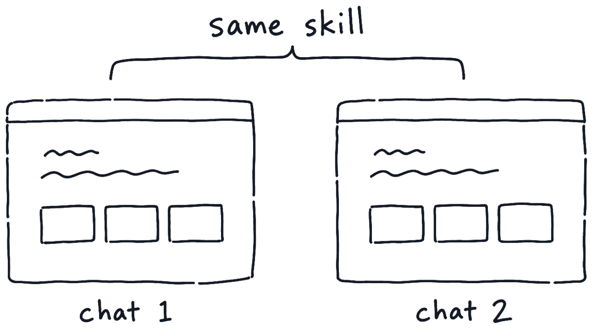
I tested this myself. I opened Claude Code with Opus in two completely separate chats and gave both the same prompt: a website for a roofing company, clean, warm and welcoming, using Anthropic’s frontend-design skill and nothing else. I got two very similar sites. The funny part is that this skill tells Claude to act as the design lead at a studio known for giving every client a distinct visual identity.
It’s one test with two runs, so it’s not proof. But it matches what Google researchers found this year: when their design agent got the same prompt five times, the results kept converging on one look. In one of their examples, all five runs came out sage green with the same heading font. If everyone sends a similar brief through the same rules, everyone gets a similar site, and the rules quietly turn into the new standard.
The rules keep moving
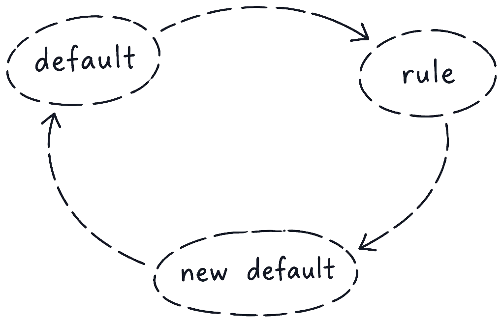
You can watch this happen in the skills themselves. Their whole history is public on GitHub, and the same loop keeps coming back: a rule names the default, everyone follows the rule, and whatever replaced it becomes the next default.
| When | The default | What the rule said | What happened next |
|---|---|---|---|
| 2020–2025 | Indigo, purple gradients, Inter, card grids | No rules yet | It became “the AI look” |
| Nov 2025 | Inter, purple | Anthropic: avoid them, and Space Grotesk too | Anthropic admits Claude still drifts to picks like Space Grotesk |
| Mar 2026 | Inter | Taste Skill: no Inter, use Geist or Satoshi | By October, Impeccable flags Inter and Geist as overused |
| Jun 2026 | The escape from purple | – | Anthropic names a new cluster: cream, a serif headline, terracotta |
| Oct 2026 | Cream, terracotta, eyebrows | Taste Skill bans them, partly based on a 247-site study | ? |
The last row is the question from the tweet. Part of Taste Skill’s newest rules come from its author’s own study of 247 sites from galleries like Awwwards and One Page Love, scored by AI models. So this year’s best-looking sites, judged by AI, become rules for everyone. I don’t know what the next AI look will be, but my bet is it’ll look a lot like this year’s gallery favourites.
The rules also come from fewer places than you’d think. The first version of Impeccable, from November 2025, started from Anthropic’s own text, a lot of it word for word. So with all these skills, we’re mostly just moving what AI leans toward.
Who decides, then?
Nobody, really. It depends on who people think made it.
Look at Anthropic’s own website: a warm off-white background, a serif typeface and a clay-orange accent. That’s almost exactly the look its own skill now calls an AI tell. The skill even says the terracotta is Anthropic’s own Claude colour, so on a client’s site it gives the AI away. On anthropic.com nobody calls it slop, because it’s Anthropic.
It works like prestige brands. People think something is better just because it costs more or has a famous name on it, and in one study people said the same wine tasted better when they were told it was more expensive. With AI it works in reverse. Studies on digital art found that people like the same picture less, and find it less creative, once it’s labelled as made by AI. Experiments have also found that people like a product more when they’re told it was made by hand. So if someone suspects your site was generated, they’ll like it less. The sad part is it doesn’t even have to be true.
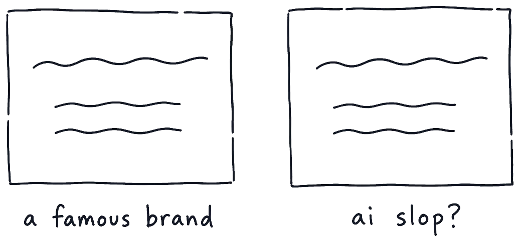
That’s what hurts real designers. Anthropic’s skill actually says the brief wins: if a client asks for cream and terracotta, use it. The rules are meant for choices nobody made. But someone looking at your site can’t see whether you chose it. Darren Shaw, who runs a local SEO company, likes eyebrows because they let him put the search keywords in the main heading while a bigger line does the selling. Now people see them and think AI, and he’s said he’ll keep using them anyway. The brand that really wants a purple gradient pays the same price.
Some rules are fine
I don’t think all rules are the problem. Some were here long before AI. Nielsen’s usability rules are from 1994, the minimum contrast for text on the web is from 2008, and nobody needs a skill to know white text on white doesn’t work. Those are logic, and it’s fine if everyone follows them.
Taste is different. It’s the part you feel but can’t really describe, and a skill can only hold what you can describe. Once you turn taste into “use this font, not that one” and enough people run it, that font becomes the new Inter. A 2024 study found the same in writing: people who got ideas from AI wrote better stories, but their stories were more alike. AI helps each of us work better, but it also makes us work the same.
So what if imperfection becomes the sign of a human? Then we just tell AI to add imperfections, and after a while people see that as slop too. It’s already starting. Hand-drawn, “imperfect” design is being pitched in 2026 trend reports as the answer to AI polish, and Impeccable already flags rough, sketchy SVG illustrations as slop.
Everyone looks in the same places
Luckily there are so many combinations of fonts, colours and layouts that all of this would take a long time. But people now look for inspiration in the same few places, often at very similar sites, so everything starts to look alike much faster. Historically, that’s not how the most memorable products got made. Anything new looks weird at first, until it becomes a hit and everyone copies it. Right now it feels like everyone wants to be the same instead of different.
So what do you do?
AI isn’t a good designer, but it’s a good website builder. People who aren’t designers will think it’s amazing technology, and it is, but they’ll also be hurting honest designers without meaning to.
When I design a site, I sketch it first on a whiteboard with a marker. I decide the fonts, the colours, the spacing and the feel myself, and Claude builds it. I have it screenshot its work and compare it with what I wanted. The less it has to decide for itself, the better the design comes out.
If you want to design a site with AI, don’t let it decide. The great thing about AI is that almost any idea can become real now, but the idea has to be yours. Define as much as you can, and collect inspiration from more than other websites. Sketch the layout, even badly. Then give AI a way to stick to your design, like screenshots it can compare against, because it will always reinterpret what you give it through its training.
And if you think Domin looks AI-made, tell me.
Thanks for reading,